
Week three of the 5ftinf Consciously Creative course is all about colour. It’s amazing just how much colour there is around you when you really look for it. What really astounded me, though, is how the process of noticing – and responding to – colour made me feel. I’d hear myself saying ‘there’s yellow!’ at the sight of some faded old road markings on muddy cobbles or ‘look at that purple’ at the sight of plastic safety barriers around road works. It was genuinely exciting. It’s not an understatement to say that looking, really looking, at the colours in the world around you is transformative. I found the process took me to a whole different, much more creative, and mindful place. It’s the opposite of the usual to-do lists or galloping work-related thoughts.
Try looking out for a colour a day, and making a visual scrapbook for yourself. It’s such a great exercise to do. Like a creative reboot. If you fancy signing up for the 5ftinf Consciously Creative course yourself, details are at the bottom of the page.
Red moodboard
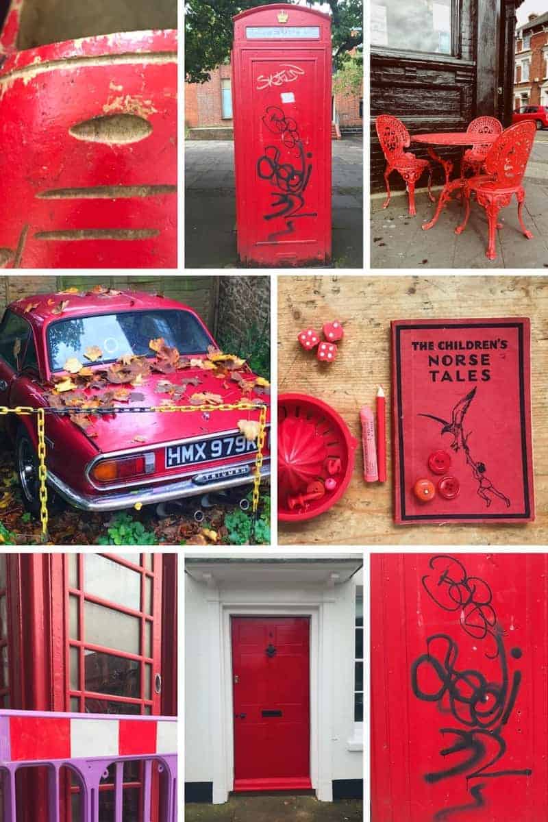
The chained up rusty old red triumph I came across became an object of fascination for me. I’m pretty sure I’d normally have walked straight past it, deep in thoughts nothing to do with my surroundings. But I was hunting for colour. And this old car was red, with yellow chains, so I saw it. Then really looked at it. Although half-covered with leaves and rusted old chains, it was still beautiful and its deep cherry red colour, despite everything, felt like a defiance.
Here’s the moodboard I did for Blue and Green

I got funny looks from the people inside the café with yellow table and chairs outside. But increasingly I don’t care. I wanted the image. I was thrilled to notice how great The Dog’s Trust yellow branding looks contrasted with the grey exterior of their shop in Godalming. Then there was the amazing blue and turquoise terraced house in Southsea on Saturday. I could go on, but it’s probably best if I point you in the direction of my Steller stories so you can browse and see more of the images I took over the week, if you’d like to. There are some great stories on the 5ftinf page too
Here’s my Yellow Story
Creating a colour wheel
As well as colour collecting, our homework for the week was to make a colour wheel and to think about opposite colours and how they work with each other.
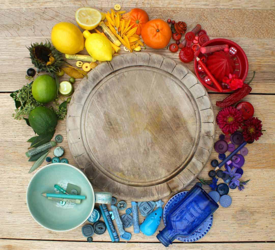
I decided to use an old bread board to help create the circle for the random objects I had ‘domestically foraged’ over the week. I loved this exercise. What you realise as you’re trying to decide where to place a green button, for instance, is that some greens are almost blue and others almost yellow. Doing the exercise, and having to really think about how the different items related to each other – and the progression of the colour wheel – felt like allowing my eyes to work much better than I normally give them the opportunity to do.
I’m not sure about the bread board and I wish I’d made the wheel a bit more accurate – it bugs me that the colours aren’t quite in the right place in relation to each other. Green for instance doesn’t go on long enough to be opposite red because I’ve given too much space to blue and aqua.
The lesson for me is to think about the surface a bit more at the beginning. I tend to get carried away with the job in hand, and rush headlong into the fun bit. I also forget to take images as I go, which is an important part of documenting the process. In hindsight I think I’d have preferred to use the more textural wooden surface I used for the next part of my homework. I think it would have added a bit more interest and mood. And I think it would have allowed the colours to sing a bit more.

Quick cup of tea, transfer my rainbow of objects onto a tray and crack on with the next bit of homework: to create a colour-based flatlay. The idea was to then add objects in colours from the opposite part of the colour wheel to see what that did.
Red and green
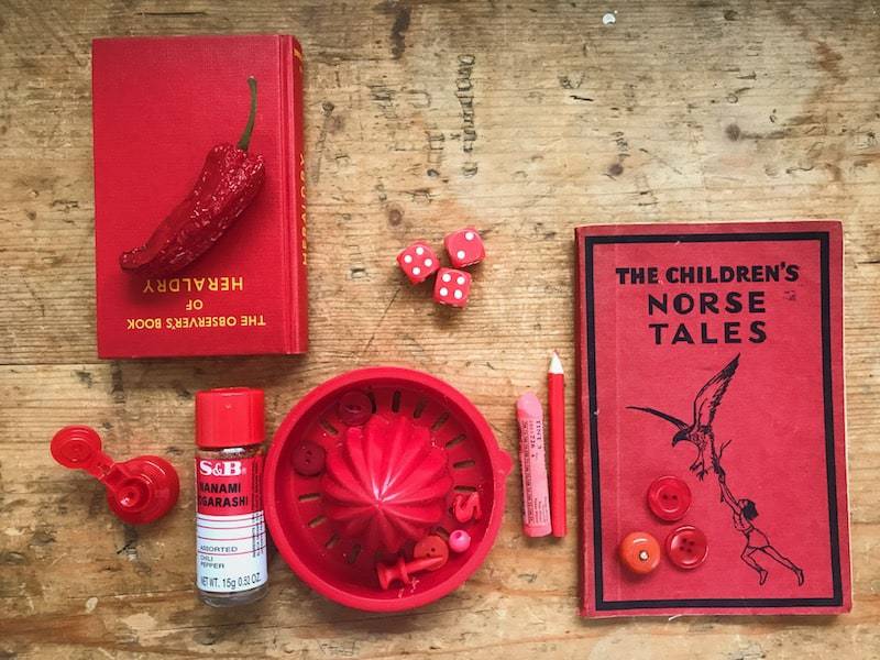
I decided to go with red. I felt the flatlay images I’d made last week were a little lifeless and forced, so I wanted to be a bit more free and easy about this one. Here’s the selection of objects I went for. I was quite happy with it as a starting point, but knew it needed some contrast.

I firstly added some green leaves and buttons but wasn’t that keen on the finished result. Green is the exact opposite to red on the spectrum so should make red feel more red. I decided it was the wrong green for me, so went for a more turquoise shade.
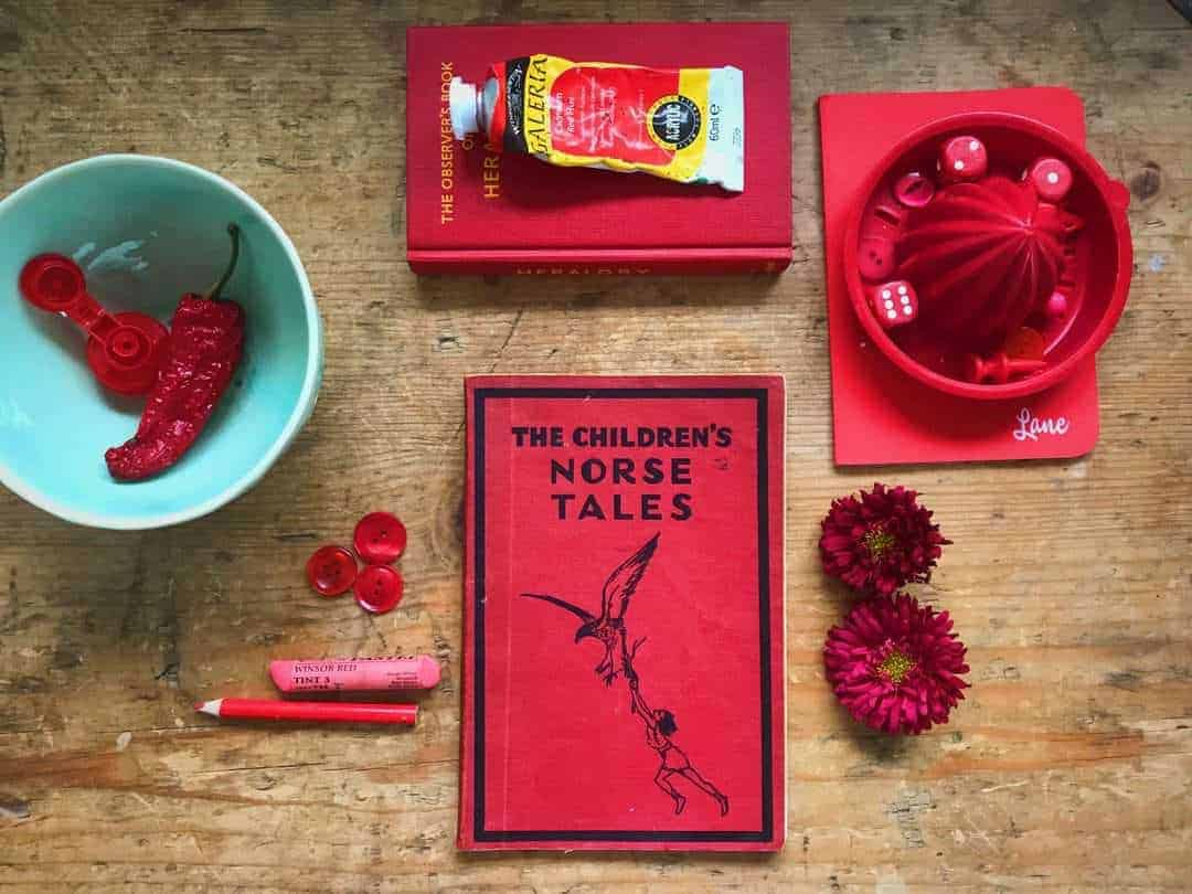
As soon as I added the aqua mug, I was happier. I added a few more, with and without the paint tube. I quite like that the yellow and white of tube stops the composition being too rigidly two-colour.

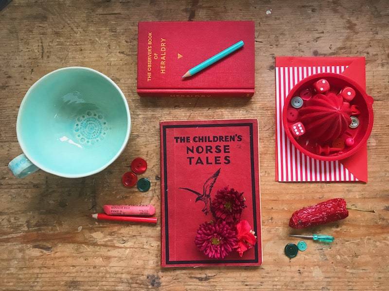
I definitely feel that the turquoise made the red feel more red and vice versa. What I think I should have done, now I think about it, is stopped and looked for a bit longer. Added some texture, taken the time to give it all more of a sense of life and mood. But I was rushing to try blue and orange.
Blue and orange

I don’t think this combination really came together for me. I’d been dying to use my old Milk of Magnesia bottle which looks so amazingly blue on a windowsill with the light coming through it. Lying flat, it lost a lot of its magic.

I wanted some bright orange elements, so decided to use Lego bricks. I’ve nearly lamed myself on the blasted things enough times over the years, so it’s about time they gave me something back. I tried grouping blue and orange separately and then mixing up together. I thought I’d like the mixed up one more but I prefer the colour blocked version. Looking at it now, I’d move the blue lego as they’re a bit blocky. I don’t like the way the two dark orange buttons are in a line and the whole thing could do with some texture. Maybe some scattered berries and how would it have looked if I’d powdered some of that beautiful bright blue pastel…? I could also do with some objects going out of shot to make it more interesting. Oh well, food for thought.

I have loved this week on the 5ftinf Consciously Creative course. My frustrations were mainly caused by lack of time and rushing to squeeze too much into the end of the week. I need to try and take more time, be more considered. Let things evolve. I am going to try and find more time over this coming week for our next theme: Shadow and Atmosphere. I can’t wait!
How to sign up for the 5ftinf Consciously Creative course
If you’d like sign up for Philippa’s 5ftinf Consciously Creative course, you’ll find all the details you need in her FBWL directory listing here


Leave a Reply