
I knew I’d enjoy playing with texture and loved the idea of having a go at creating a textural flatlay. Texture was the subject of week 2 of the inspiring 5ftinf Consciously Creative course (see my blog about week 1 – Abstract Matching here).
My working week is already more than full, so I have to do most of the ‘work’ for the course at the weekend. I have the ideas and themes ticking in my mind and I gather images as I go – walking the dog is always a good source (although he does get fed up waiting for me to take images of mud, broken glass on the road, feathers, bark… you name it).
Slow Walking
I gather these images together into a series of stories on Steller I’ve called Slow Walking. It’s about taking it slowly to take in what’s around you to see, hear, smell, touch. Here’s a selection of my images from this week, looking for texture.

Creating an Autumnal flatlay
At the weekend I take the time to pull together the actual homework for the week. So I went out Saturday morning to buy flowers and matcha tea powder. I’d seen Philippa add gorgeously bright green matcha powder to the textural flatlay she had created as part of this week’s live tutorial and I wanted some of my own! It wasn’t cheap, but what an amazing naturally bright colour. I decided to try drinking some. Not sure if I made it quite right, but I would definitely rather spoon matcha tea powder onto a table than actually drink it!
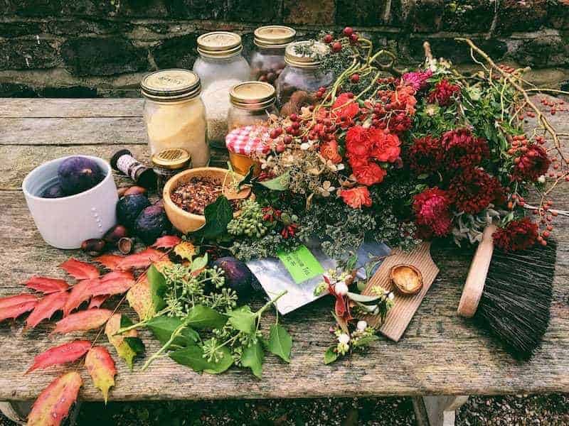
Flowers at my local market were in all sorts of wonderful Autumnal colours. I went for deep red helichrysums, bright orange carnations (why haven’t I bought carnations for decades?) and dark orange berries. I felt so happy spending a sunny Saturday morning choosing and buying objects purely because I loved their colour and texture. Waitrose is a different place when all you’re really interested in is what the contents of a packet might actually look like. I’d wanted some brightly coloured old-fashioned boiled sweets to smash up but couldn’t find what I was looking for. I didn’t think Tangfastics would really cut it. I did find some figs in a wonderful deep purple though and I knew I wanted to slice them to see the seeded red insides.

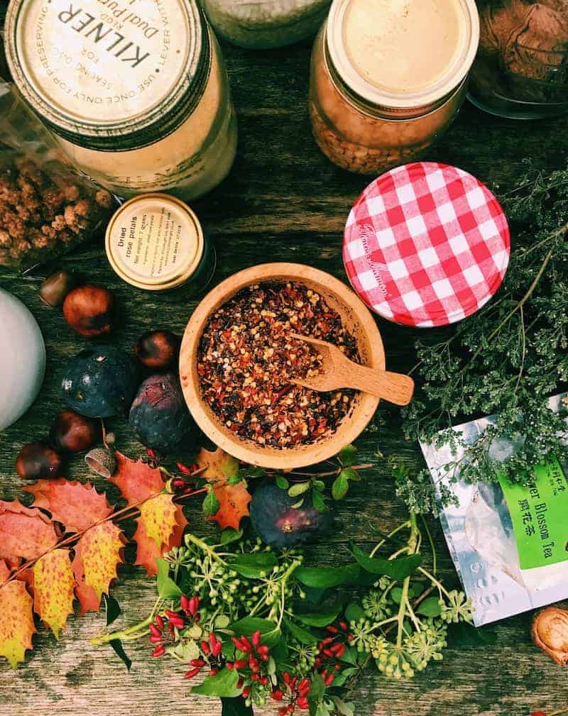
I pulled together other objects from around the house and garden that I thought might work in the images I’d be creating. A pair of old red wooden clogs, vintage buttons, a paint-spattered wooden artist’s palette, vivid yellow turmeric powder, an old butter pat and jars of textural grains and seeds from the food cupboard. ‘Domestic foraging’ Philippa calls it. I love that! I also love that all the odd bits and bobs that I have picked up over the years now actually have a purpose! I knew those red clogs would come in handy if I waited long enough…
Sunday was the day I’d set aside for actually working on the exercise we’d been set as homework. The theme was using texture as visual punctuation in a flatlay composition. I’m not sure that flatlays come that naturally for me. But I decided to throw myself into the idea. And to be braver with editing images to ‘bring out the feeling’ as Philippa suggests. I have tried photo editing filters before but have usually tended to go back to the original image and been very restrained in editing saturation, contrast, warmth etc from there. I think I might have been a little too constrained and uncreative in this area, so I decided to push the boat out this week and go a little further than feels totally comfortable. I did feel quite excited seeing how much more colour and life you can add to an image.
Photo editing – before and after
Here’s a shot of the raw materials gathered together before I started. The flowers look really grey and lifeless in the original image don’t they? It feels like I might have saturated the colours a little too much in the second shot, but I do like the way it makes me feel…

I don’t always have my glasses to hand when I’m grabbing a few minutes to edit images, so I think I might have gone a touch Disney here and there this week!
Documenting the process
Step one was to set up a simple composition with similar objects, without worrying to much about how they sit or fall at this stage. I started with heads from the dark red helichrysum flowers I’d bought and lay them on an old table I’d salvaged from behind the oil tank. It has spent a couple of years outside and is now definitely ‘textural’… I swept off most of the mould and dead leaves and actually really loved what this left behind. Weathered and grainy old wood with all sorts of texture and depth.

I did take a photo of this first very simple first step but for some reason the images got lost when I tried to export them. I decided to add some figs that I’d sliced in half to add more deep red as well as texture and shape.
It was all looking a bit flat and uninteresting so I added some tiny red berries I’d picked as well as some yellow lentils. Adding a splash of yellow made me want to add more. So I spooned on some turmeric powder.
I was definitely liking the composition more now so added some polenta and chilli flakes to see what that did. Looking at the image again now, I feel that there’s something missing from the centre of the image. The whole fig feels a bit plonked. In fact I think I should have tried putting a few whole figs together rather than having everything dotted around so separately. I like what adding the purple petals did for the whole figs though.
I wish I’d compared the way the images had been edited a bit more carefully too – I’d have made them more consistent. I do feel that I am learning so much on this course. Particularly when things don’t go quite right or how I’d like them to.

Sweeping up then having another go…
What’s interesting is that I really liked the look of the contents on the dustpan when I swept up. I feel that this was me responding to the overly ‘forced’ way I went about trying to do a flatlay. I think I need to try and ‘feel’ it more. And to really look carefully at the image in detail and how the elements sit with one another.

I decided to have another go. This time I wanted to use the painter’s palette and play with mirroring the colours of the old paint with textures. What I like most about the image I ended up with is the sweep of yellow that was made by me clearing up the first shot and the red petals I decided to scatter. This image makes me feel something. I might have gone a touch too far trying to add elements (I was determined to use that matcha tea somewhere!) but I think it has something about it.


Leave a Reply